Formatting a paper to the strict standards of the ABNT (Associação Brasileira de Normas Técnicas) often feels like solving a puzzle where the pieces just refuse to fit. You have spent weeks researching and writing, but that dedication can quickly be overshadowed if your document fails the initial “eye test.” According to experienced university evaluators, formatting is the very first detail an examiner notices before they even read a single word of your introduction. Rather than viewing these requirements as a frustrating chore, consider them a highly effective tool to instantly establish your professional credibility and avoid needless point deductions. The actual Interesting Info about abnt espaçamento entre parágrafos.
Think of proper ABNT paragraph spacing as essential breathing room for your text. While the official regras da NBR 14724 para formatação might sound like a complex legal code, the foundational rule of using 1.5 line spacing exists purely for readability, not to be difficult. Mastering this organização visual de artigos científicos delivers three crucial benefits:
- Producing a polished, professional appearance that highlights your hard work.
- Ensuring effortless readability for the examiners grading your text.
- Guaranteeing absolute adherence to formal submission standards.
Are your long quotes looking a bit cramped, or do you still hit the ‘Enter’ key twice between ideas? Properly applying standard 1.5 spacing, 1.25 cm first-line indentations, and handling single-spaced exceptions creates a seamless reading experience and eliminates preventable formatting errors.
The Foundation of NBR 14724: Understanding the Rulebook for Academic Formatting
Knowing exactly where to look for formatting rules changes everything. The ultimate “source of truth” for your academic work is NBR 14724, the official standard dictating how a TCC or thesis should look. Think of this document not as a punishment, but as your essential guia de formatação de teses e dissertações. By standardizing the visual layout, this rulebook ensures your research is highly accessible and easy for evaluators to read without any distracting formatting quirks.
Before diving into your word processor’s settings, it is crucial to separate the two main types of spacing that trip up most writers. Line spacing (entrelinhas) is the vertical space between the individual lines of text inside a single paragraph. In contrast, paragraph spacing refers to the vertical gap added before or after the entire text block. Many people confuse the two, mistakenly hitting “Enter” twice to separate their ideas, which actually breaks the rules.
To easily satisfy the strict regras da NBR 14724 para formatação, you only need to apply two specific numbers: 1.5 for line spacing and exactly 0pt (zero points) for paragraph spacing. This means the visual break between your ideas relies entirely on a small first-line indent, eliminating the need for empty white space between paragraphs.
Mastering the 1.5 Line Spacing: Why It Is the ‘Gold Standard’ for Readability
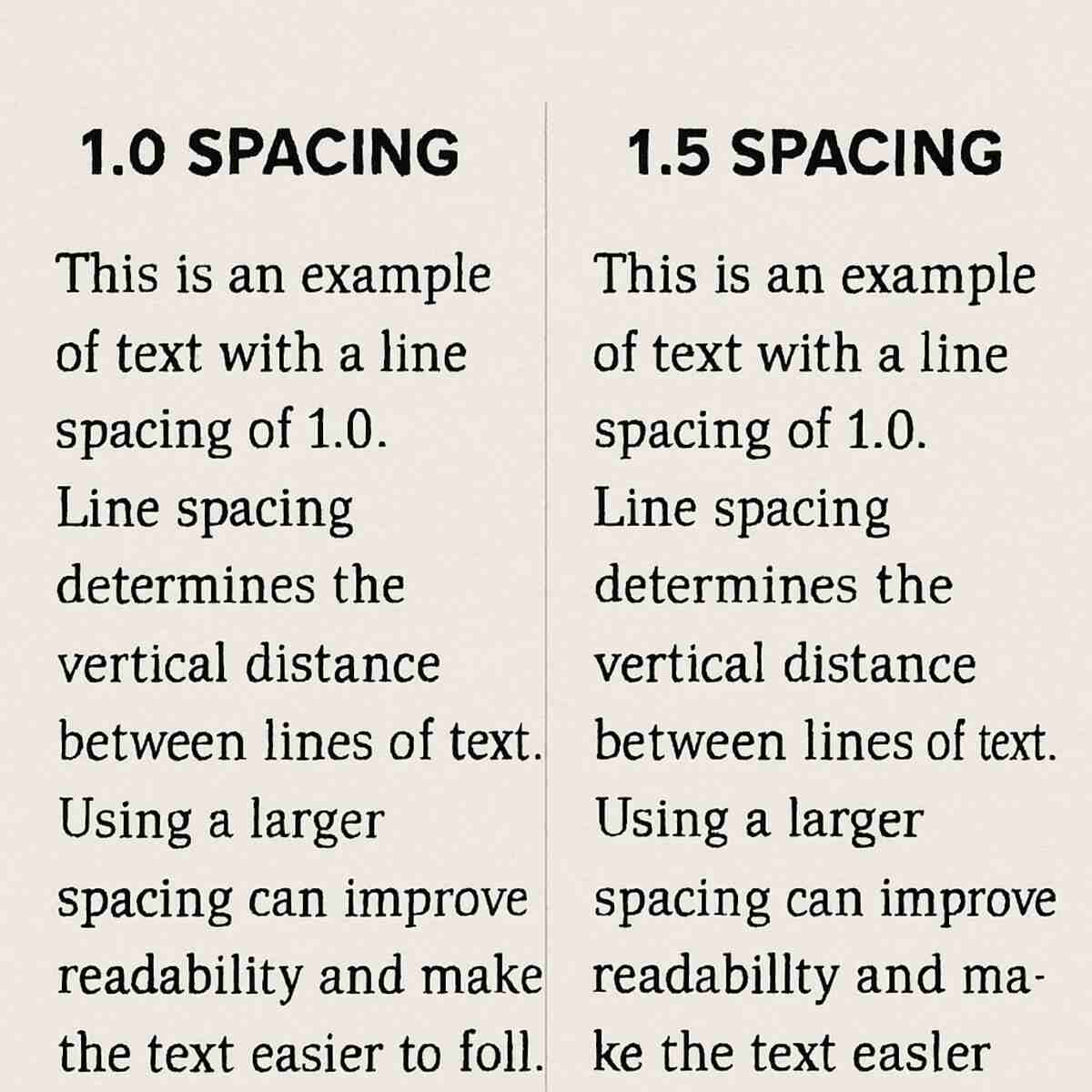
Do not let a dense, unreadable page distract evaluators from your hard work. Think of line spacing as the necessary gap for your words to stand out clearly. In academic formatting, the diferença entre espaçamento simples e um e meio is essentially the difference between a cramped, overwhelming wall of text and a professional, inviting document. ABNT mandates 1.5 line spacing for your main body text because it hits the perfect visual sweet spot: it separates your lines just enough to reduce eye strain while giving professors room to leave printed comments.
Understanding this foundational rule saves you hours of formatting headaches right before your deadline. Unless you are dealing with specific, rare exceptions like long block quotes or footnotes, every single paragraph you write needs this exact treatment. When you define your general abnt paragraph spacing, remember that this 1.5 measurement applies continuously throughout your introduction, methodology, and conclusion. Fortunately, to configurar entrelinhas 1, 5 no Word, you just need to highlight your text and select the 1.5 option from the standard Paragraph menu, instantly upgrading your draft.
Seeing this transformation side-by-side proves exactly why the standard exists; the correct 1.5 version simply passes the “eye test” for clean academic reading. Standardizing this vertical alignment sets the stage for accurate horizontal formatting.
The 1.25 cm First-Line Indent: Creating a Visual ‘Reset’ for Your Reader
Now that your lines have room vertically, your reader’s eyes need a clear horizontal signal to know when a new idea begins. A proper first-line indent acts as a visual “reset” button, creating a clean edge that guides the reader smoothly through your arguments. When you need to configurar parágrafo em normas técnicas, incorporating this small gap prevents your pages from looking like an intimidating, endless block of words.
The absolute golden rule for academic writing is setting this horizontal gap at exactly 1.25 centimeters. A common mistake writers make is pressing the spacebar multiple times or relying on the “Tab” key, which might look fine on your screen but often ruins alignment when printed or opened on another computer. Learning como fazer recuo de parágrafo 1, 25 cm directly through your word processor’s paragraph menu ensures permanent stability across your entire document, protecting your hard work from messy, preventable formatting errors.
Once you lock in this automated setting, every new block of text instantly snaps into the correct position. Figuring out como padronizar recuo de primeira linha guarantees you will never have to guess where an idea starts, giving your document that polished, uniform look that evaluators expect.
The ‘No Space Between Paragraphs’ Rule: Breaking the Double-Enter Habit
Have you ever hit the “Enter” key twice to separate your ideas, ending up with massive white gaps running down your page? While that visual break might look nice on a casual blog, it strictly violates academic formatting rules. In proper abnt paragraph spacing, the horizontal 1.25 cm indent does all the heavy lifting to signal a new thought. Consequently, the standard mandates absolutely zero extra vertical space between standard body paragraphs.
Modern word processors often fight against this rule by silently sneaking in extra room every time you press enter. Programs like Microsoft Word naturally add 8 or 10 points of space after a paragraph by default. To fix this and remover espaçamento automático entre parágrafos, you must tell your software to stop “helping” you. Leaving these hidden gaps wastes valuable page space and looks careless to evaluators who instantly spot the inconsistency.
Fixing this formatting takes just a few clicks. After selecting your text, follow these exact steps to lock in the proper rules:
- Open your editor’s “Paragraph” settings menu.
- Locate the specific section labeled “Spacing.”
- Change the “Before” value to exactly 0pt.
- Change the “After” value to exactly 0pt.
Removing these hidden gaps creates perfectly flowing standard text that adheres strictly to academic guidelines.
Navigating the Single-Spacing Exception: When to Shrink Your Gaps
Getting your main text into a perfect 1.5 rhythm establishes a solid foundation, but academic papers are rarely made of just standard paragraphs. Eventually, you will need to include supporting elements that require a tighter, more condensed look. This is where you encounter the fundamental diferença entre espaçamento simples e um e meio. While standard 1.5 spacing provides comfortable clearance for your primary arguments, single spacing (1.0) deliberately shrinks those gaps to create visually distinct “compact zones.”
These compact zones instantly signal to your reader that they are looking at secondary, supporting information rather than your main voice. Following the exact normas para notas de rodapé e legendas ensures these secondary elements don’t overwhelm your page or look unnecessarily bulky. You must switch your word processor’s settings to single spacing for four specific document elements:
- Long quotes: Essential for proper formatação de citações diretas longas (any copied text exceeding three lines).
- Footnotes: The extra explanatory details resting at the bottom of your page.
- Visual labels: The descriptive captions and legends placed directly under tables, graphs, or figures.
- References: Your finalized bibliography list at the end of the paper.
Shrinking the vertical gaps in these specific areas immediately helps your evaluator differentiate your original analysis from external evidence. Keeping supporting notes tightly grouped ensures your main arguments remain the undeniable focal point of the page.
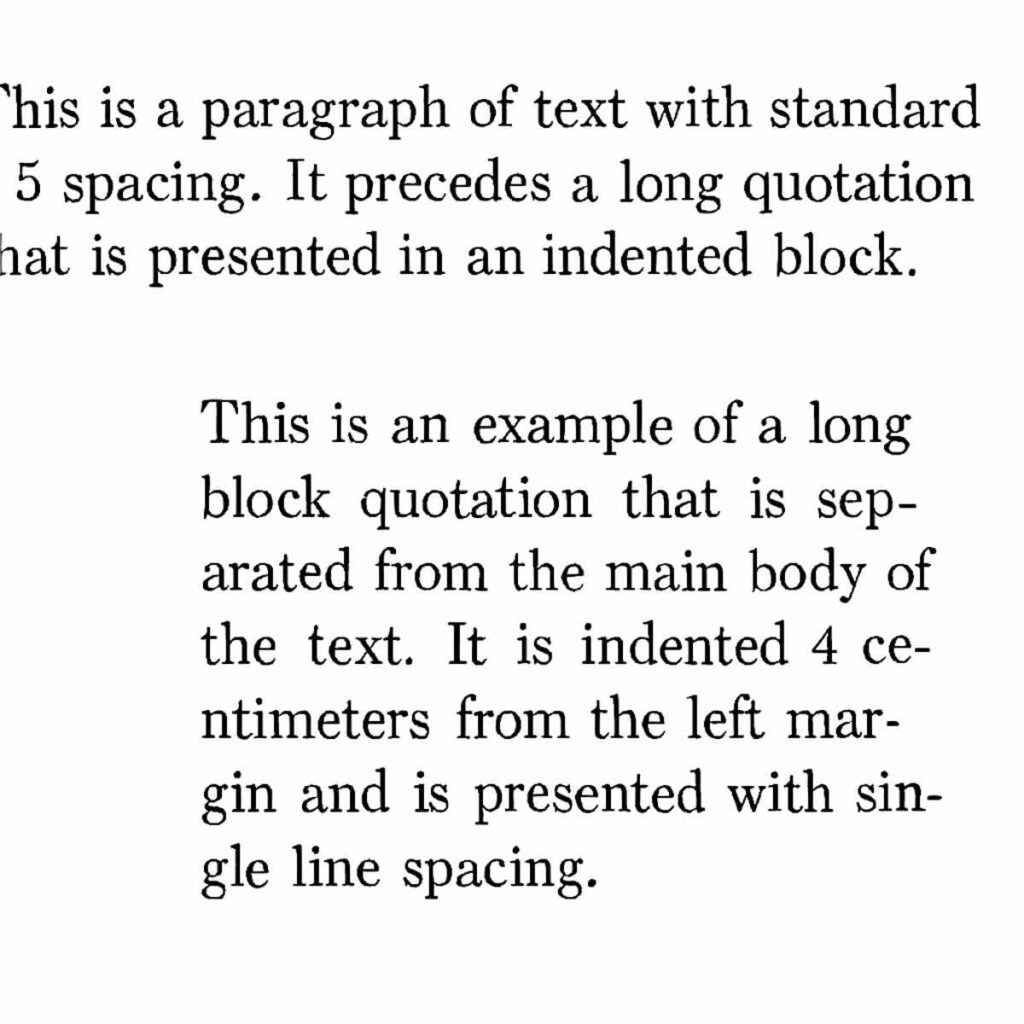
The 4 cm Indent for Direct Quotes: Handling Long Citations Correctly
When a copied text stretches past three lines, it requires a complete visual shift. Instead of keeping these words woven into your regular paragraphs, you must detach them to form a distinct block. This introduces the required recuo de 4 cm abnt. Pushing the entire chunk exactly four centimeters inward from the left margin creates a hard physical boundary between your original analysis and the external source.
This separation works in tandem with typography tweaks to achieve proper formatação de citações diretas longas. Alongside the single spacing mentioned earlier, you must shrink the font—typically down to size 10. Because this compact, indented block layout undeniably screams that the text is borrowed, ABNT dictates dropping quotation marks entirely. The visual structure itself does the talking for you, preventing unnecessary punctuation clutter while distinctly framing the citation.
Learning como formatar citação longa takes just seconds in your word processor’s Paragraph menu by simply typing “4 cm” into the left indent box. Once your external evidence is neatly tucked away, it seamlessly integrates into the broader document structure.
Title Spacing Secrets: How Much Room Should Be Between Headers and Text?
You have structured your chapters logically, but cramming your paragraphs right up against your headings can make the document look suffocating. When students wonder qual o espaço entre parágrafo e título, the answer lies in providing adequate visual clearance. ABNT requires a clear, standardized separation to signal that a new section is beginning, acting as a mental pause for your reader before they dive into the new topic.
The official rule for espaçamento entre títulos e texto abnt is straightforward: you must leave exactly one blank line of 1.5 spacing above and below your section headers. Think of this as creating a protective buffer around your titles and subtitles. Whether you are opening a brand new chapter or introducing a minor sub-topic, applying this uniform white space ensures a clean, professional hierarchy throughout your entire paper.
Implementing this layout trick requires no complicated menu settings; simply press the “Enter” key once before and after the header while your standard 1.5 line spacing is active. Consistent application of this expansive gap matches the rhythm of your main body text effortlessly.
Footnotes and Legends: Managing Compact Text at the Bottom of the Page
Dropping supplemental information to the bottom of the page keeps your main argument flowing, but these elements require a different visual treatment. Under normas para notas de rodapé e legendas, the primary goal is compression to save valuable page space. ABNT requires footnotes to use single spacing rather than the standard 1.5 used in your body paragraphs. Coupled with a smaller font size—typically size 10—this compact format ensures your extra details remain helpful but never distracting.
Applying this compact rule to your visuals is equally crucial for a clean, professional finish. Whether you are labeling a data chart or citing a photograph, the espaçamento em legendas de figuras must also be set to single spacing. Think of captions and legends as quiet assistants to your text; they should sit tightly against their graphics, using that same smaller font to clearly explain visual data without fighting for the reader’s attention.
Mastering these specific exceptions seamlessly balances the comfortable spacing of your main text with the tight efficiency of supporting details.
Tutorial: Configuring ABNT Spacing in Microsoft Word in 60 Seconds
Microsoft Word has a central control panel that configures your academic layout all at once. Instead of clicking ten different buttons to configurar parágrafo em normas técnicas, you can adjust your indents and line gaps from a single menu. This method saves you from hunting down individual tools and guarantees your document maintains a perfectly consistent look.
Before adjusting settings, decide if you are starting a fresh page or fixing an existing draft. If your paper is already written, simply press “Ctrl + A” on your keyboard to select all your text first. Taking a moment to validate these settings uniformly prevents rogue sentences from looking out of place and lets you write with peace of mind.
Now, navigate to the main ribbon at the top of your screen and follow this exact sequence to lock in your settings:
- Go to the Home tab, find the “Paragraph” group, and click the tiny arrow in the bottom-right corner to open the Paragraph Settings dialog box.
- Under the “Indentation” section, find the “Special” dropdown, choose First line, and type 1.25 cm.
- In the “Spacing” section, ensure both Before and After are set strictly to 0 pt so you do not create accidental gaps between paragraphs.
- Finally, to configurar entrelinhas 1, 5 no Word, change the “Line spacing” dropdown to 1.5 lines and hit OK.
Your document is now officially calibrated to pass the visual inspection of any strict evaluator, freeing you to focus on research rather than worrying about formatting technicalities.
Tutorial: Mastering ABNT Formatting in Google Docs
Collaborating in the cloud means you can write from anywhere, but it also requires knowing exactly where your formatting tools are hidden. Figuring out the espaçamento abnt google docs setup might seem tricky because the menus differ from traditional desktop software. However, the platform actually offers a streamlined way to apply your standard 1.5 gap between lines.
The most efficient strategy is using the specific control panel that handles both line and paragraph gaps simultaneously. Highlight your entire draft, then follow this exact path to lock in your settings:
- Click Format in the top menu.
- Hover over Line & paragraph spacing.
- Select Custom spacing.
- Set Line spacing to 1.5.
- Set Paragraph spacing to 0 before and 0 after, then hit Apply.
Mastering the first-line indentation requires a quick visual adjustment using the document’s built-in measuring tool. If you are wondering como formatar parágrafo google docs for that mandatory 1.25 cm start, simply look at the ruler above your page. Drag the top light blue rectangle slightly to the right until it sits precisely halfway between the 1 and 1.5 cm marks, leaving the bottom triangle behind at zero. This ensures your paper possesses the exact horizontal and vertical layout needed to pass a formal evaluation.
The ‘Justified’ Alignment Rule: Creating Professional Text Blocks
When you open a fresh document, your word processor naturally aligns text to the left side of the page, leaving the right edge jagged and uneven. While this ragged look is fine for casual emails, an official document demands a sharper appearance. To meet formal requirements, you must switch your text to a justified format, which stretches each line so the words touch both the left and right borders perfectly.
Applying this alinhamento justificado em trabalhos acadêmicos transforms your writing into a clean, professional block of text. By subtly adjusting the tiny micro-spaces between individual words, the software ensures your paragraphs flow evenly across the entire horizontal page width. This strict padronização de parágrafo eliminates distracting visual gaps at the end of lines, allowing the evaluator’s eyes to track smoothly down the page without stumbling over messy borders.
The keyboard shortcut for achieving these flush edges is remarkably simple: just highlight your text and press Ctrl+J. These perfectly straight horizontal lines naturally complement accurate page boundaries.
Standardizing Margins to Protect Your Spacing: The 3-3-2-2 Rule
Perfectly squared-off text won’t look professional if the invisible frame holding it on the page is unbalanced. Think of margins as a protective border that keeps your words safe from the paper’s edge. To achieve the correct padronização de margens para TCC, ABNT uses a specific formula designed to center the visual weight of your text while leaving physical room for printing. This setup is universally known as the margens abnt 3 3 2 2 rule.
Why use uneven numbers instead of equal spacing all around? The extra space on the left serves a highly practical purpose: it gives you room to bind or staple the physical document without burying your text inside the spine. Setting these exact boundaries in your page layout menu also ensures your 1.25 cm paragraph indentations don’t look awkwardly pushed off-center:
- Superior/Esquerda: 3cm
- Inferior/Direita: 2cm
With the outer frame locked in, standard justified paragraphs sit securely and professionally on the page.
Handling Reference Lists: The Unique Spacing Rules for Bibliographies
Reaching the end of your document feels like a victory, but the bibliography introduces a sudden formatting plot twist. Just when you mastered the 1.5 standard for main chapters, the rules change. You must switch to single line spacing within each entry. This condensed layout visually signals a structured catalog of sources rather than an ongoing narrative, making the espaçamento referências abnt entirely distinct from the rest of your work.
Another major shift happens at the start of your lines. While the traditional 1.25 cm indent acted as a helpful reset button for new paragraphs earlier, it must be completely dropped here. Reference entries sit flush against the left margin. Additionally, you will abandon justified text entirely. Bibliographies are aligned strictly to the left to prevent awkward, stretched-out gaps between long book titles and lengthy website links.
Because these individual entries are densely packed, you must create clear boundaries between them. The essential trick for como formatar bibliografia correctly is inserting exactly one blank single-spaced line between every entry, saving the reader from an overwhelming wall of text.
Automating with Styles: How to Never Manually Format a Paragraph Again
Manually adjusting every single block of text throughout a fifty-page thesis is a guaranteed recipe for frustration. You have likely experienced the tedium of highlighting sections one by one to verify their indentation and settings. Instead of treating every new chapter as a separate, time-consuming chore, you can easily command your word processor to do all the heavy lifting for you.
Think of the “Styles” or “Paragraph Styles” menu in your software as a master remote control for your formatting. Setting up a custom template permanently saves the correct rules right inside your document. This smart feature bundles strict requirements—like your 1.5 line spacing and zero extra before/after gaps—into a single, clickable button you can name “Standard ABNT.”
The true power of this automation strategy lies in guaranteeing absolute consistency from your introduction to your conclusion. Whenever you need to configurar parágrafo em normas técnicas, simply type your text, click your newly created custom button, and watch the 1.25 cm indent instantly snap into place.
Even better, if you discover a formatting mistake later, modifying your master template instantly corrects the entire document in seconds. Mastering these estilos do Word ABNT effectively foolproofs your layout against accidental manual variations.
Common Spacing ‘Fails’ and How to Fix Them in a Single Pass
Copying research snippets directly from internet sources often drags invisible junk formatting into your pristine document. When your layout suddenly looks disorganized, you will need to quickly remover espaçamento automático entre parágrafos that websites secretly sneak in. The easiest way to spot these hidden errors is by activating the “Show/Hide ¶” button (the Pilcrow symbol) in your word processor’s toolbar, which instantly reveals every invisible space, tab, and ‘Enter’ keystroke you—or your browser—accidentally added.
Once those formatting marks are visible on your screen, you can confidently run a five-minute final audit before printing or converting your work to a PDF. Run through this straightforward checklist to guarantee your formatting is flawless:
- Confirm your main text utilizes the standard 1.5 line spacing.
- Verify como padronizar recuo de primeira linha by checking every starting indent is exactly 1.25 cm.
- Ensure your “Before” and “After” paragraph gaps are strictly set to 0pt.
- Hunt down and delete any double Pilcrow marks (¶¶) to eliminate accidental empty lines.
- Check that your overall text alignment is “Justified” for clean, straight margins.
Cleaning up these invisible glitches transforms a sloppy draft into a polished manuscript.
Spacing for Figures and Tables: Ensuring Visual Data is ABNT-Compliant
When you introduce a chart or image to your research, a new set of formatting rules dictates how that element sits within your text. While your main paragraphs use standard 1.5 spacing, the text framing your visual data requires a tighter approach. Following the normas para notas de rodapé e legendas, the title sits directly above the visual, and the source sits below it, both utilizing a smaller font size and single line spacing to clearly connect them to the graphic.
Inside the actual data grid, the espaçamento em tabelas abnt shifts expectations to prioritize concise clarity. Every cell must use single spacing, acting as a compact zone that prevents your information from sprawling unnecessarily. This restricted layout ensures that numbers and text labels remain highly readable without stretching the overall vertical height of the box.
Efficiently controlling these dimensions serves as your best defense against awkwardly splitting a graphic right across two pages. Keeping visual data intact on a single sheet preserves a polished, professional appearance.
The Role of Page Breaks: Managing Spacing at the End of Chapters
Finishing a chapter often triggers a terrible formatting habit: holding down the “Enter” key until the cursor reaches a fresh sheet. While this might look acceptable initially, it acts like a ticking time bomb for your layout. If you edit text upstream, those empty lines simply shift, dragging your next chapter title halfway down the screen and ruining the organização visual de artigos científicos.
Preventing this chaos requires using a quebra de página abnt (page break) instead of manual spaces. Think of this tool as an invisible anchor commanding the software to instantly jump to the top of the next sheet, ignoring any remaining blank space. Pressing “Ctrl + Enter” (or “Command + Enter” on a Mac) guarantees your new chapter always starts exactly at the top, bulletproofing your document against future text additions.
Major structural shifts sometimes demand an even stronger divider known as a Section Break. Section breaks function as formatting firewalls, allowing structural changes—like restarting page numbers—without altering previous chapters.
ABNT for Scientific Articles vs. TCCs: Do the Spacing Rules Change?
Transitioning from a massive thesis to a concise paper might make you wonder if the formatting rules shrink along with your word count. Fortunately, the core standard for scientific articles—known as NBR 6022—mirrors what you already know. It relies on the familiar 1.5 abnt paragraph spacing to give reviewers plenty of visual clearance. Whenever you lack specific instructions, this standard remains your safest default.
Publication, however, introduces a crucial exception: individual journal guidelines will always override these general rules. When preparing your final submission, you must often abandon the comfortable 1.5 spacing to match a publisher’s exact print requirements. These journal-specific adjustments typically include:
- Tighter line spacing (frequently single-spaced) to save valuable page real estate.
- Double-column layouts that drastically change how your paragraphs stack.
- Smaller margins that compress your text into dense blocks.
Mastering when to apply standard rules versus journal overrides guarantees the expected visual organization required by editorial boards.
Abstracts and Keywords: Formatting the Entryway to Your Research
Your abstract is the first impression reviewers get of your work, and its layout temporarily breaks the rules you just learned. Proper formatação de resumo abnt requires creating a single, solid block of text rather than standard body paragraphs. To achieve this visual design, you must completely remove the familiar 1.25 cm first-line indentation, pushing the start of your sentence flush against the left margin.
Because this summary needs to be concise, it abandons the standard 1.5 setting used throughout your chapters. Instead, you will apply single spacing across the entire abstract, compacting your core arguments into a dense, highly readable zone. This tight formatting immediately signals to the reader that they are looking at a standalone overview rather than the actual introduction to your narrative.
Just below this dense block sits your list of indexing terms, which demands equal attention. The correct espaçamento palavras-chave separates these terms from the abstract with just one blank line, maintaining the same single-spaced, non-indented alignment. Locking in this clean entryway appropriately frames the underlying research.
Spacing for Appendices and Annexes: Finishing Your Document Strong
Reaching the final pages of your research project brings a huge sense of relief, but this is not the time to abandon your formatting habits. Even though supplementary materials sit outside the core chapters, proper espaçamento apêndices abnt demands the exact same visual structure as your main text. You must continue using that familiar 1.5 line spacing and 1.25 cm first-line indentation for any original paragraphs you write here.
These layout rules stay completely consistent regardless of whose work is being attached. Whether you are adding an Appendix (such as an interview transcript you created) or an Annex (like a government decree created by someone else), correct anexos formatação starts with distinct, capitalized headers centered at the top of a new page. Any introductory text explaining these attachments simply follows standard body formatting rules to maintain a clean aesthetic.
Because reviewers often scrutinize these post-textual elements to verify your methodology, this section requires the same structural care as your main arguments. Locking in standard 1.5 spacing ensures supplementary text remains highly readable.
Troubleshooting ‘Hidden’ Spacing: Removing Extra Points in the Style Gallery
Strict formatting can be frustrating when your software secretly works against you. You might notice paragraphs looking strangely far apart, even with standard 1.5 line spacing applied. This happens because programs often inject “ghost spacing”—usually an invisible 8pt or 10pt (points) gap whenever you press “Enter.” To follow the rules strictly, you must remover espaçamento automático entre parágrafos so the distance between text blocks remains completely flush and perfectly even.
Fixing this issue permanently saves you from fighting your word processor on every new assignment. By right-clicking the “Normal” text option in your Style Gallery and choosing “Modify,” you can override the software’s default template. Simply locate the spacing menu and manually type “0pt” in both the “Before” and “After” boxes. Checking the option to apply this change to all new documents allows you to configurar parágrafo em normas técnicas for good, relying only on your first-line indentations to signal new ideas visually.
Taking control of these underlying templates protects your layout during file sharing and submission, ensuring your formatting does not break when opened on another computer.
Final Review: Achieving a Flawless Academic Layout with ABNT Precision
ABNT paragraph spacing serves as a structured framework rather than an arbitrary hurdle. By understanding the visual mechanics behind the numbers, you have transformed your word processor from a source of anxiety into a reliable assistant.
Before exporting your final document, run your pages through this final success checklist:
- Main text at 1.5 spacing?
- First-line indent at exactly 1.25 cm?
- Before and after paragraph gaps set to 0pt?
- Text alignment completely justified?
- Page margins set to standard 3-3-2-2 cm?
Hitting these exact marks guarantees your work seamlessly matches the expectations of any standard guia de formatação de teses e dissertações. More importantly, your document now formally passes the essential “eye test,” projecting immediate professional credibility to your evaluators before they even read the first sentence.
Applying this checklist ensures your document passes formal review, allowing your research content to stand on its own merit.